Research
We started by researching different posters from a range of genres including western, gangster, sci-fi, thriller and comedy. This gave us an idea of what conventions are covered in a magazine. We also learnt in more detail what we would need to include for our genre: Political Horror/Thriller. We took into consideration the colours, the focal point, the audience and genre in each poster.
Western

|
What are the main colours used in the poster and why have they been used?
The colours used in this poster are reds, oranges and violets. They all compliment each other and blend into one another this is effective as the poster is a cartoon style. It also reflects the mood of the film as it is a western. The colour red is dominant in part of the poster- as it is a Tarantino film traditionally this represents the gore and blood within the film. The title is in the foreground is a much lighter orange compared to the dark reds/oranges in the background. This is effective as it stands out amongst the busy background which shows all the other actors. Cleverly the title of the film is a name therefore by it standing out against the other characters in the film suggest Django is the protagonist. The violets connote lust and are used over the women, stereotypically this is seen as a more female colour therefore is used to draw in a female audience as well. What is the main focal point of the Poster?
This poster is extremely busy, this is following the style of Tarantino, the focal point is the title of the film 'Django Unchained' this suggests to the readers that the film is focused on the character 'Django'. However the portrait of Leonardo Di Caprio is also another focal point as he is a well known actor in Hollywood therefore big fans of Di Caprio would be drawn into watching this film. Who do you think is the intended audience for the poster?
The audience for this film seems to be a much older audience. This is due to the guns shown on the poster and the portrait of the woman dressed in a burlesque costume. The two people dancing on the poster also suggest their is going to be romance taking place in the film therefore this would be suited to a more older audience. |
Comedy

|
What are the main colours used in the poster and why have they been used? In this poster of Grown Ups the colours used are a combination of light blue, white and yellow. These fit within the comedy genre as they are 'light-hearted' colours giving the poster connotations of feeling happy. This is effective as the audience will be interested in watching this film. The clear blue sky suggests they are in a sunny place this is also reflected in the yellow rubber rings. The white text compliments the blue as they look like clouds. What is the main focal point of the Poster?
In this poster the focal point is Adam Sandler and the other actors in this film on a water slide in a theme park. This fits in with the comedy genre as they are older men on a slide which looks as if it should be for children this is used in order to humour the audience. This is ironic to the title as it is called 'Grown Ups'. The characters are shown smiling, this is effective as it suggests to the audience they are having a good time therefore by watching it you will also feel happy and laugh. This is an effective focal point as it gives an insight to the characters personalities and what they get up to in the film. Who do you think is the intended audience for the poster?
As the title is 'Grown Ups' it suggests this film is targeted for adults as they can relate to the film. The actors in the film are also much older therefore fans may be of similar age. They are also re-living childlike behavious therefore this humour would suit an older audience. |
Action

|
What are the main colours used in the poster and why have they been used? The main colour used in this poster is black, this is used surrounding Angelina Jolie's face. This is effective as she is emerging from the darkness suggesting she is a mysterious character. In the film she is a spy, the dark background suggests she is disguising herself due to the background being dark and being blending through her hair. The only other colours used are of her flesh, this shows she is revealing some of herself and luring audiences in. What is the main focal point of the poster?
The focal point of this poster is Angelina Jolies face. The close up fills the whole poster suggesting the film is based around her. Her eyes are looking directly into the camera this is effective as it shows she is looking directly at the audience. This draws in fans of Angelina Jolie. Who do you think is the intended audience for the poster?
This poster looks as if it is targeted towards an older audience. This is due to the dark lighting suggesting it features some dark elements in the film. The poster is simplistic therefore people of a younger audience may find this boring and not be interested in any features of the poster. Along with the font which is also simplistic. Fans of Angelina Jolie may also be older therefore they would be more interested in watching the film. |
Gangster

|
What are the main colours used in the poster and why have they been used? The colours used in this poster are black, silver and a touch of red. This makes the poster look very slick- this fits in within a gangster genre as most of their work is hidden. This is shown in the poster as it is simplistic. The touch of red suggests the danger and murder which is involved in American Gangster. The silhoutte of the city is in silver this suggests it is wealthy and almost sparkling like silver does. This fits in with a Gangster genre as a typical convention is money and crime. What is the main focal point of the poster?
In the American Gangster poster the main focal point is Denzel Washington as a long shot takes up most of the poster. His identity is not revealed this suggests he has some sort of dominance in the film. His body is in a silhoutte this suggests just like the Salt poster he is hiding his identity. The city is also a focal point, this reveals American Gangster is based in New York. Who do you think is the intended audience for the poster?
The poster for American Gangster is for an older audience as most gangster films are for an older audience. This is evident in the poster when Denzel Washington is shown holding a gun. This suggests the film contains violence and killings therefore is not suitable for a younger audience. |
Sci-Fi

|
What are the main colours used in the poster and why have they been used?
The main colours used on this poster for Avatar is a deep blue. This represents the Avatars which feature in the film; this iconic colour is recognisable to audiences. The blue is a dark shade giving the Avatar more depth, only half of it's face is revealed this gives the Avatar some sort of mystery and a side unknown to the audience. This is used to interest audiences into watching the film. The background is black this gives the film mystery and suggests Avatars are in an unknown place. The light blue used for the title is an electrifying blue suggesting Avatars are full of life. The colours used are simplistic but effective as you associate blue with an Avatar. What is the main focal point of the poster?
The focal point of this poster is the Avatar. This is used as this film is a sci-fi therefore using an unusual character suggests it is alien-like. It is also the unique selling point of the film Avatar; the unusual face draws in audiences interests of what a Avatar could be. They have used just the face and nothing else in the poster to keep it simplistic. Who do you think is the intended audience for the poster?
Avatar targets a world wide audience, therefore is targeted for all ages including children. |
Inspiration
We looked at the Smiley Poster in detail as this was a poster which stood out to us. Smiley is from the horror genre and is based around an antagonist with a mask. This is similar to our film where the Piggy Banker is also shown in a mask. therefore we wanted to use inspiration from this poster to replicate in our own. We done this by analysing and breakind down different parts of the poster:
Smiley Poster

Planning
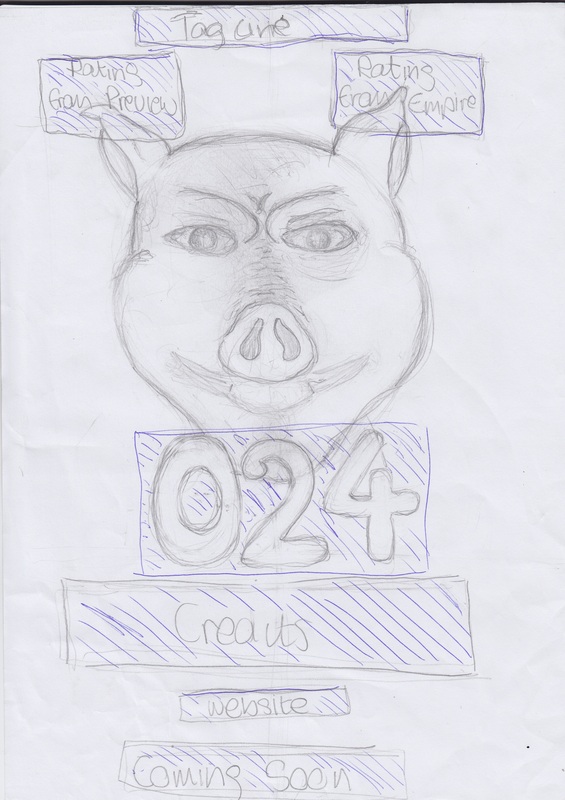
Firstly we drafted our initial idea for the poster, we knew the Piggy Banker was the focal point and using the Smiley Poster as inspiration we started to imagine our own poster. As you can see the pig dominates the poster; this helped us organise what type of photographs we need to take in order to suceed this. We need to focus on close ups and extreme close ups. We also need to take into consideration the fonts we are going to use in our poster. This sketch helped us think ahead of what we need to do in our next steps.
Below is our Photo shoot of the Piggy Banker; we focused on close ups and extreme close ups as he was the main focal point of the magazine. We practiced a range of lighting such as River Cop, Split Lighting and Rim Lighting on a black backdrop, this was to achieve a sinister feel. This was sucessful as we wanted our poster to look dark in order to fit in with the horror genre. This was shown in the smiley poster when the face is darkly lit, we tried to create this same look in our photographs.
Photoshop Experimentation
1) We created our Poster on Photoshop, before we came to our final product we experimented a few styles to see which one looks the most effective. Our first experimentation shows the Piggy Banker with the union jack with a thick red stripe across his face, we thought this looked effective as it connotes the danger the pig can cause and emphasises on his threatening character. However we thought the red dominated his face too much and drew away attention from the rest of the poster.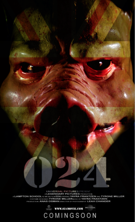
|
2) On our second experimentation we were inspired by American Gangster to include a silhoutte of the city, we thought this was relevant as 024 is set in London therefore the city features throughout the film. The movie also ridicules the upper class in society therefore we thought by showing the city it suggests the Piggy Banker is about to take it over, however we did not continue with this idea as we thought the silhoutte dismisses the simplistic effect we were trying to acheive.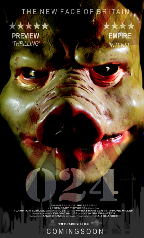
|
Process:
Final Product

