Research
Empire


In order to create a successful magazine we looked at magazines on the market which are currently established and are well respected in their given industry. This helped us understand the conventions of a magazine and a style we should replicate for our own magazine cover. We looked at the followng, Empire, Entertainment and Total Film these are all well known magazines in the Hollywood industry.
Firstly, we looked into an accomplished magazine brand "Empire". We looked at this magazine as they are well established and are always covering successful blockbuster films. We looked at posters to get an initial inspiration for our own. We did this by analysing and deconstructing the conventions of Empire magazine.

The magazine had a darkish theme and tone and is very serious as well as having an element of scare. The title stands out and is really distinctive against the characters face. It is also very clear who the writers of the magazine are. The character in the shot is the villain in the batman series, however this is not a shot from the film. The figure is also centralized making the entire focus being on him. Instantly we can see an expression which is signature for the film in question. This is a very good technique as it is incorporates film aspects, but using a shot that has been specifically taken for the magazine cover. The framing is also effective as the character takes over the whole front cover, and
even with the multiple text still makes him the focus point of the magazine.
|

The title is distinct as it uses a unique Empire font, however it is customised according to the edition of magazine. For example the magazine is promoting the Joker and The Dark Knight film, therefore the font used is black with a neon outer glow to stand out from the Jokers face. The black and green colour scheme represents Batman however the green connotes evil/jelousy this represents the Joker as he is the focal point of the cover.

This reveals other films featuring in this edition, this is to promote and inform readers, this targets a wider audience, the films are similar genres therefore draws in a familiar audience with the chosen genre.

Empire draw in interests by including extra information around the focal point, this informs the readers of an extra 12 page interview, this is an extra selling point. as well as the actor being linked to the film. It promotes more sales, especially for fans of Clint Eastwood.
|

This cover is very patriotic as it is promoting Captain America this is shown using the american flag as a background, and the usual red used for the Empire title has been changed to white to match the stars on the flag. Again the character is centralized and is striking a pose not from the movie. Instantly the reader knows what this film is called due to the solid writing captain american on the front cover, There are also various captions and titles around the magazine which are of a similar style to the magazine.
|
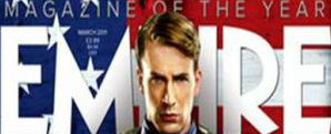
The Empire font is used again however the colour has changed occurding to the edition. Here a white font is being used as it is promoting 'Captain America' this compliments the white stars in the American flag.

Once again the text includes what is inside the magazine, this is effective as readers may not be interested in Captain American however they may be interested in 'The Real Exorcist' which is from a different genre. Therefore this text attracts a wider audience.

This is addressed to Marvel fans, the yellow badge stands out from the american flag backdrop and makes the magazine exclusive.
|
Entertainment


We also looked at Entertainment magazine, similarly to Empire they also feature the main character in the center, however they focus on mid shots or long shots showing off the full length of the character in or without costume. They also utilise advertising by putting films and or adverts of similar genre around the magazine cover this provides secondary advertsing.

This magazine is promoting Iron Man, this is clear with the focal point being Iron Man in the centre, however his face is revealed and he is only partly in costume making him distinct but making the actor familiar with the readers. His red costume is eye-catching compared to the light hearted colours of blue and white. This makes him stand out from the background. The two characters on either side suggests Iron Man is the focal point of this magazine therefore inside their is going to be more on him. They dominate the cover as minimal text is used around them and they overlap the Entertainment title, this gives them some sort of power.
|

The title is in a vibrant blue, this is contrasted to the deep red of the costumes shown on the cover. This makes it clear. Although it is covered by the three characters head we can still establish it is an Entertainment magazine due to the distinct font and colour.

This is a smart caption as it highlights that the superhero has returned hence indicating this is a sequel. There is also a good use of a rhetorical question, "Did you miss me" which engages the readers and viewers of the magazine. It is also centralised on the main character to draw readers attention.

This extra information is shown at the top of the page, leaving the rest of the cover dedicated to Iron Man. However this will still draw in audiences interested in fantasy/myth genres as both True Blood and Harry Potter are from this genre. Unlike the other magazines we have looked at this magazine covers all Entertainment including TV Dramas aswell as films. Therefore the audience is much more diverse than Empire and Total Film. By including extra information on top of the page will attract wider audiences.
|

|
This magazine again features more than one centralised character, however the main character is in the foreground suggesting to the readers they are the main character in the film. The yellow and orange colour used for the font compliment the fiery background and the title 'Catching Fire'. The expression on their faces and costume and props suggest this is an action film. The silver body suits suggest a futuristic feel. The background is effective as it links with the title, the use of green screen as been effectively used here. The rest of the cover has minimal text, this seems to be a convention of Entertainment- the cover focuses on the actors only.
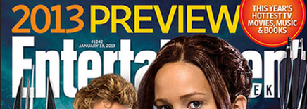
Once again the title is dominated by the actors. However it is still clear that it is an Entertainment magazine. The use of orange and yellow is effective as it compliments the Fire in the background and the title 'Catching Fire' The font size of '2013 Preview' is large, this is to catch audiences attention and seems to be one of the main selling points of this magazine.

The caption "first look at catching fire" is really effective as it draws in readers in the centre of the magazine, therefore it becomes the focal point. It makes it seem like this is the only magazine currently to have looked at the film in detail, therefore draws in big fans of catching fire. It is also effective as it makes the magazine more exclusive.
|
Total Film


This Total Film magazine is unique as it is a Marvel Edition, therefore it is targeted to fans of Marvel. Thor dominates the cover, therefore the font, title and colours compliment him. Thor is the 'God of Thunder' this is reflected in the magazine with a dark background with a thundery sky, the font has also been customised to looks as though it is thunder. The colour scheme red, black and white is effective as the white stands strong against the black background. Unlike Entertainment, Total Film also includes a lot of text on the cover of the magazine to draw in readers.
|
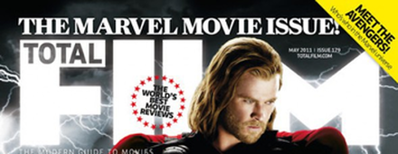
'The Marvel Movie Issue!' is written as a banner across the top of the magazine, this is effective as it is the first thing readers see. This magazine edition is specifically for Marvel fans and allows the magazine to include other Marvel characters. The text is white, this suggests the colour of thunder to compliment the character on the front of the magazine- Thor. Even though the font for Total Film is still the same it has been customised to suit the edition.
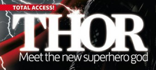
Having the name of the film ‘Thor’ in a bold font reinforces how it is the main focal point. Also adding the banner "total access" suggests the magazine is exclusive this is another selling point as it highlights the fact that this magazine has covered everything. The caption "meet the superhero god" also brags but encourages readers to buy the magazine, by glamourising the main character.
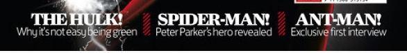
The bottom of the magazine has various names of other superhero's, with exclamation marks after which adds further excitement. It therefore adds to the audiences interest. The names at the bottom of the magazine are all relevant as they are all superheroes from Marvel. The captions below are also good as they use humour "its not easy being green" this humorous caption will further add to the audience's interest to purchase the magazine.
|

|
This Total Film Edition has been clearly customised to promote the film Avatar. This is obvious with the use of the colour blue; this dominant colour represents the characters in the film therefore readers who see this will automatically associate this film magazine with Avatar. The text around the magazine are white and grey, these both compliment the Avatar and the colour blue. The Avatar is the focal point in the magazine, the shot is a face on mid-shot and he is looking directly at the camera this is effective as it catches audiences attention. You are also able to see some costumes and props therefore learn more about the Avatar character.
The Total Film title is dominated by the Avatar, however it is clear this is a Total Film magazine due to the iconic font.
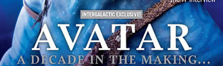
The title of the film is also in the centre of the magazine making it one of the key focal points.
|
Planning
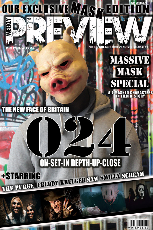
After our research we had an idea of what we wanted to include in our magazine. We started my sketching up a draft to give ourselves a visual plan of what to include on our magazine. We had learnt the conventions of different types of magazines, therefore combined all these ideas to create a realistic cover of our own. We thought it was vital to make the pig our focal point as this is a reoccurring theme for most magazines- to have one character as the focal point. This was useful as it gave us an idea when we came to creating it of where to place the titles, texts, photographs and captions.
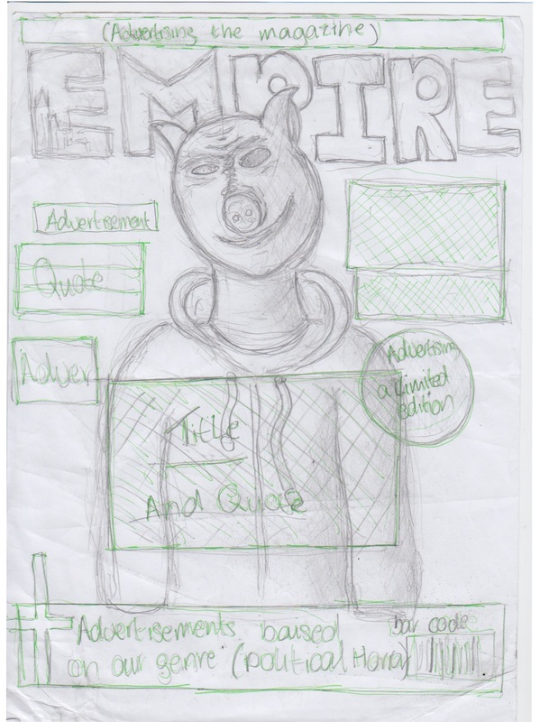
Photo shoot
We used the same location as we used in our trailer to take photographs for our magazine cover- Waterloo Leake Street. This was intentionally to make sure our magazine and film complimented each other. We wanted to establish an image for the pig and we thought the graffiti walls would represent the pig and is also a theme in our trailer. We practiced a range of long shots, mid-shots and close ups as we wanted the capture the unusual mask. The pig mask looked effective in contrast to the colourful graffiti walls.
Photoshop Experimentation: Title/Font
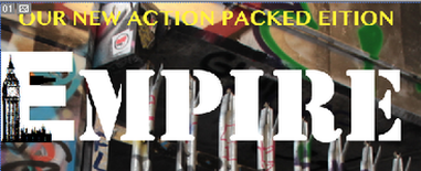
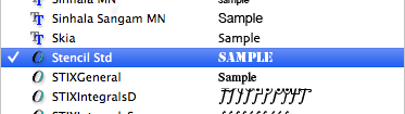
We based our magazine around Empire; we started to create some Titles for our magazine. We experimented with the 'Stencil' font as this was also used in our trailer and poster, however this idea did not work as Empire as a iconic font by changing it did not make the magazine look like a traditional Empite magazine. Therefore we found a similar font that is used on real Empire magazines.
We also experimented by placing a Big Ben icon on the letter 'E' we thought this would customise our magazine to suit our film- as our film is based in London and features a scene of Big Ben in the opening of the trailer. This would make our magazine compliment our trailer and audiences would understand how they are linked. We used an outline of Big Ben as it looked as if it had been graffitied on the 'E' this also follows the grafftiti theme in our trailer.
We chose the font to be white as the background is very colourful and busy therefore any other colour was not clear enough. Followung the style of Empire the font is bold and stands out instantly drawing in audiences attention. We also experimented with a caption selling this edition; this was to make our magazine more interesting to our readers. This follows conventions of other magazines as they typically make them special editons.
|
|
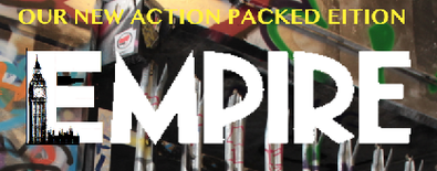
We changed the title of our film to 'Preview' we thought this was an effective name as this magazine gives you first insight into all new films. We wanted this title to fit in with 024, we did this by using the font 'Urban Jungle' this font suited the rest of our magazine and our film as it looked distressed and rundown- as if it had been graffitied. It also had a cut out cityscape at the bottom, this complimeted our film as it is set in London, it is based in the big city and features a lot of iconic buildings in the trailer.
The colour of the font was white, as we experimented before white is the only colour that stands out against the graffiti background. We made this an occuring theme for the rest of the magazine and continued to use the colour white for the other texts. We also enlarged the size making it the largest text on the cover, this was typical in magazines as the title is always eye-catching.
The colour of the font was white, as we experimented before white is the only colour that stands out against the graffiti background. We made this an occuring theme for the rest of the magazine and continued to use the colour white for the other texts. We also enlarged the size making it the largest text on the cover, this was typical in magazines as the title is always eye-catching.

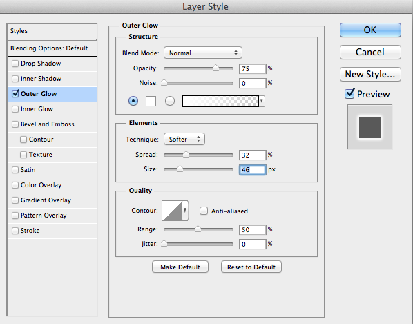
As our background was busy, we had to make sure our text stood out. We did this by adding an 'Outer Glow' as we were following a white theme, we used a black outer glow in contrast to make the text even more bold. We did this for all the text on the cover, to make it blend in well with the background we altered the spread. This blurred the outer glow creating an effect which looked as if it had been graffitied on. This complimented the graffiti background and made the text and background blend well together. This follows conventions of magazine as they customise their covers in order to promote a film.
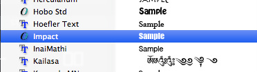
The two fonts we used were 'Impact' and 'Stencil STD'. Impact suited our magazine as most magazines use a bold but simplistic font, the texts stood out with this font and were clear for the audiences to read. We then used Stencil Std on our cover as this was the same font we used in our trailer and the poster. Therefore audiences can identify we are promoting the film 024.
|
|
Process:
Final Product